WSM
.gif)
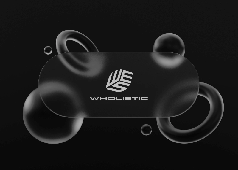
I developed the full brand identity for Wholistic Sports Management — a startup committed to supporting athletes beyond the game. The challenge was to create a look and feel that balanced bold professionalism with genuine care. The logo was designed to reflect their mission of nurturing the whole athlete — integrating mental, physical, and emotional support into one interconnected system. Paired with a refined color palette and modern type system, the identity captures both the strength of performance and the softness of care.
%20copy.webp)
%20IMG%203.webp)
.webp)
Wholistic Sports Management
Category: Brand Identity
Role: Brand Designer & Strategist
Outcome: A bold, thoughtful visual identity that reflects a modern, athlete-first philosophy — integrating mind, body, and business.
The Challenge
Wholistic Sports Management wasn’t just launching a business — they were making a statement: athletes deserve more than contracts and stats. They deserve care.
The founder came to me with a clear vision but no visual system to match. My job was to create a brand identity that didn’t feel like every other agency. It needed to feel intentional. Forward-thinking. Human.
The Process
Discovery & Strategy
- Worked closely with the founder to distill the company’s mission, audience, and core differentiators
- Identified key traits to anchor the brand: strength, empathy, modernity, and trust
- Conducted competitive analysis to avoid visual clichés in the sports industry
Moodboard & Visual Language
- Built a moodboard that blended editorial sharpness with human-centered storytelling
- Explored ways to visualize wholeness — merging movement, structure, and clarity into the design direction
Logo System
- Designed a geometric, interlocking logo mark representing the interconnectedness of physical, mental, and emotional well-being
- Refined into a versatile lockup that could scale across formats — from contracts to apparel
Typography & Color
- Chose a modern sans-serif font with quiet authority — strong but not rigid
- Developed a palette that balanced boldness with care: deep navies, resilient greens, soft neutrals
- Each hue was chosen to reflect energy, balance, and stability
Brand Feel
- Modern, clean, and elevated — but not out of reach
- Built for a generation of athletes who want more than agents — they want advocates
- The visual system reflects growth, movement, and intentional care
Deliverables
- Primary and secondary logo marks
- Full logo suite with usage guidelines
- Custom color system and typography
- Brand voice and tone direction
- Application mockups (digital + print)
The Outcome
Wholistic Sports Management launched with a distinct identity that looked and felt different. It set the tone for everything — from pitch decks to social content to future athlete partnerships.
More than just a logo, the brand became a promise: we see the whole you.