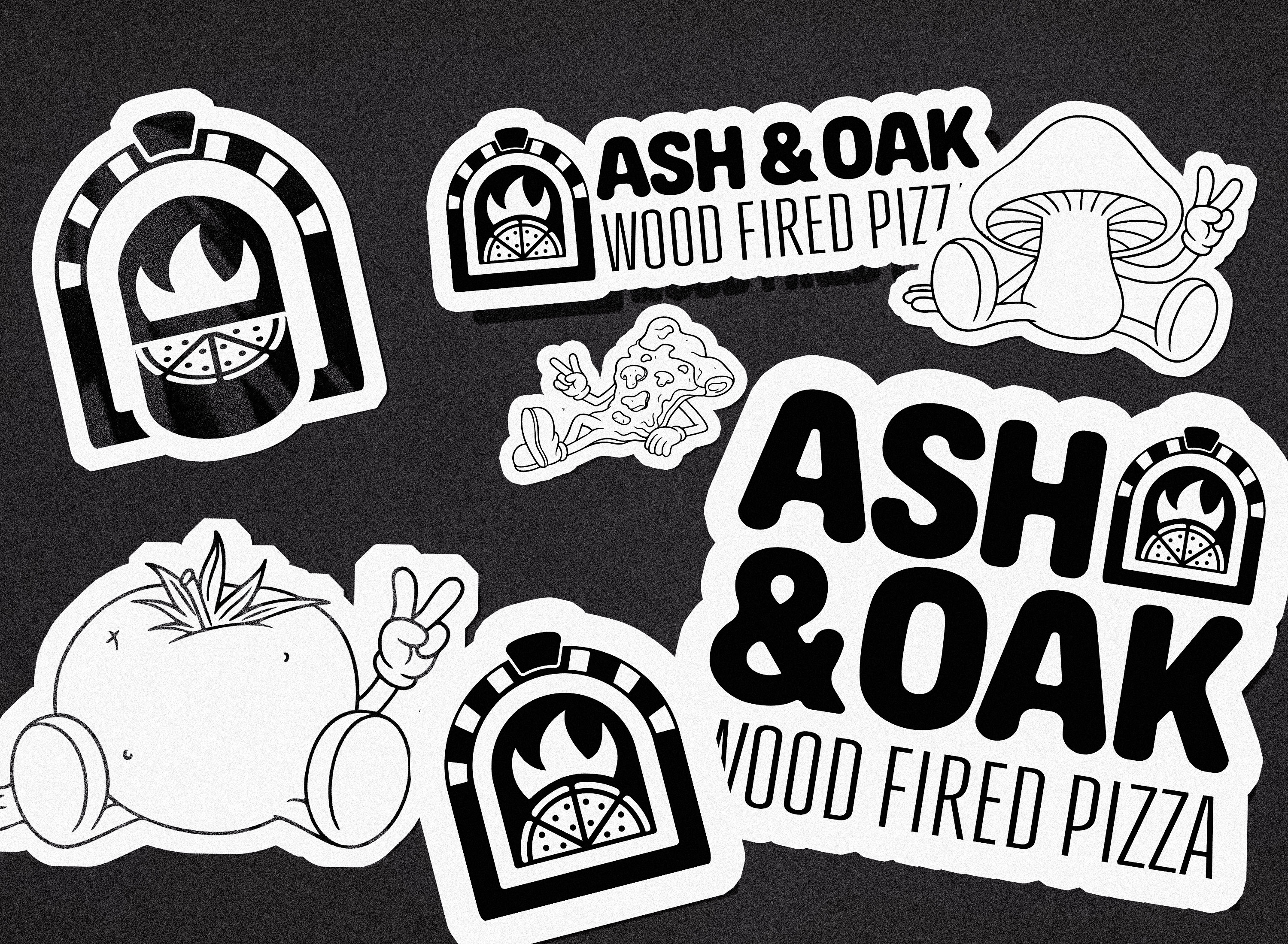
ASH & OAK WOOD FIRED PIZZA
I developed the full brand identity for Ash & Oak, a wood-fired pizzeria grounded in craft and Southern edge. From logo to color system, the brand was built to feel worn-in but refined — something that could stand out in a crowded market while still feeling like a local staple. Every detail was shaped to reflect fire, comfort, and quiet confidence.
%20copy.jpg)
ASH & OAK WOOD FIRED PIZZA
Category: Branding
Timeline: ~6 weeks
Tools Used: Adobe Illustrator, Photoshop
Client: Alex & Jameela Tapia
The Setup
Ash & Oak started with a name and a buildout in progress — no brand identity, no visual direction, and no messaging. Just a simple idea: fresh, wood-fired pizza done right. Local sourcing, handmade dough, bread fresh out the fire. No shortcuts.
They weren’t looking for anything flashy or corporate. The vision was something grounded, personal, and honest. A neighborhood spot that felt like a discovery — almost like a speakeasy for pizza lovers.
Discovery & Research
Before anything else, I had them fill out a brand questionnaire to get a clear view of their goals, values, and aesthetic leanings. Their responses were consistent:
- Keywords: Community. Fire. Brick. Warmth.
- Style: Soft modern. Identifiable. Slightly gritty but friendly.
- Ideal customer: Midtown and Oakleigh locals, social foodies, walk-in regulars.
- Vibe: Not sterile. Not too trendy. Definitely not corporate.
From there, I created a Pinterest moodboard focused on material-driven design: iron, wood grain, paper textures, serif typography, shadows, and warmth. Everything had to feel tactile — lived-in, not over-designed.
Creative Direction
I built two distinct concepts to reflect the duality they were leaning toward:
- High-End Minimalist – inspired by speakeasies and boutique restaurants. Clean serif mark, muted color palette, heavy on texture and negative space.
- Gritty-Fun Neighborhood Spot – with playful language, louder color contrast, and a logo mark that felt more hand-crafted and raw.
Both concepts were rooted in real, usable systems. Not just logos, but identity approaches they could grow into.
Iteration & Feedback
We met three times over Zoom/in-person:
- Meeting 1 was full discovery: moodboard review, competitor brand audit, and collaborative selection of references.
- Meeting 2 included two full visual concepts presented in mockups — logo, color, type, merch, menus, etc.
- Round 1 Revisions focused on logo shape, color tone, and voice tone. The speakeasy version felt “too upscale,” and the gritty version needed refinement.
- Round 2 Revisions locked in a hybrid system: structured, elegant serif type softened with warm tones, subtle texture, and minimal use of contrast color.
They wanted the final brand to be approachable, stylish, and slightly hidden. That meant no obvious pizza iconography, no cartoon flames — just a system that reflected how they cooked: slow, deliberate, fire-first.
Final Brand System
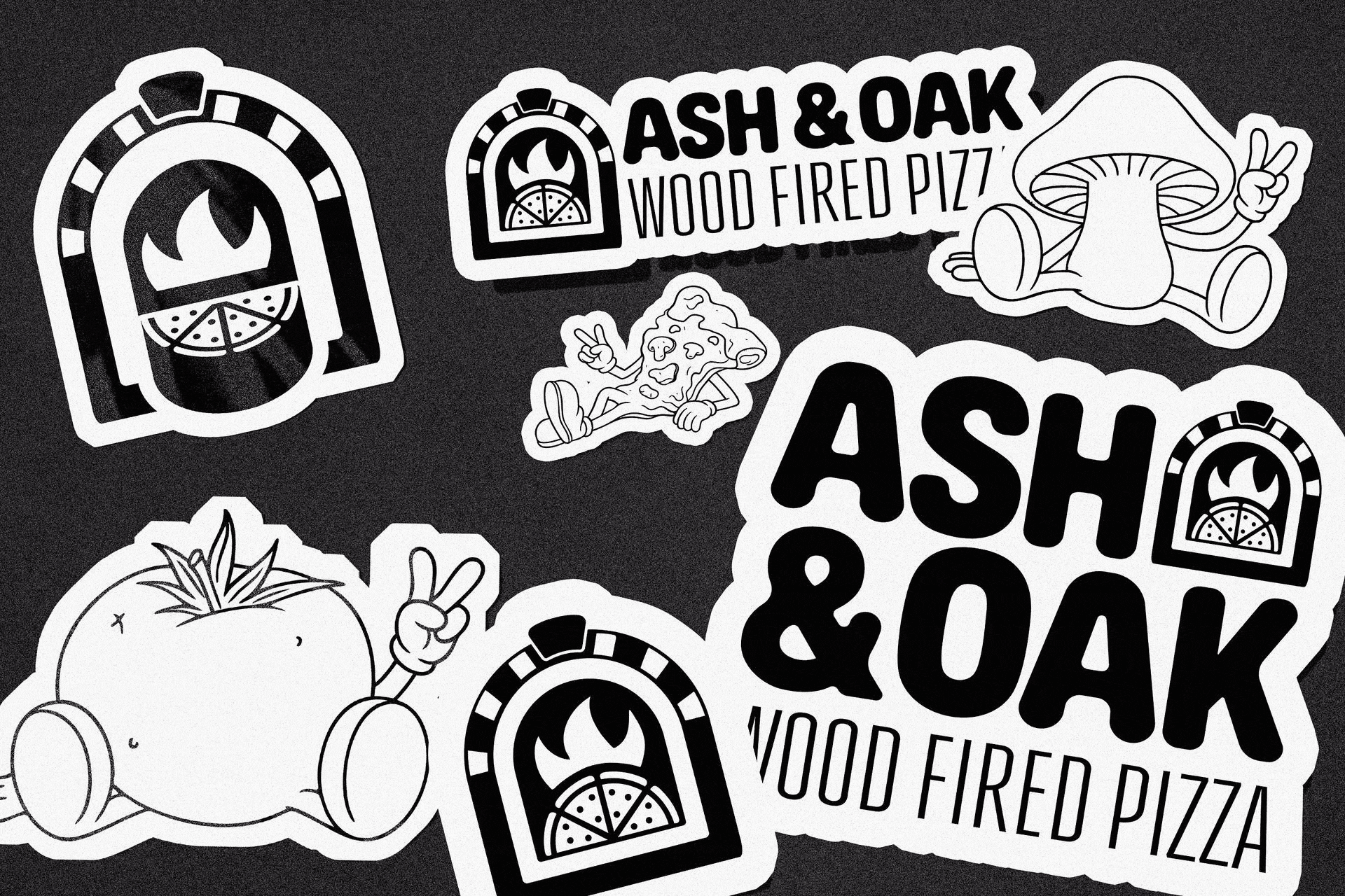
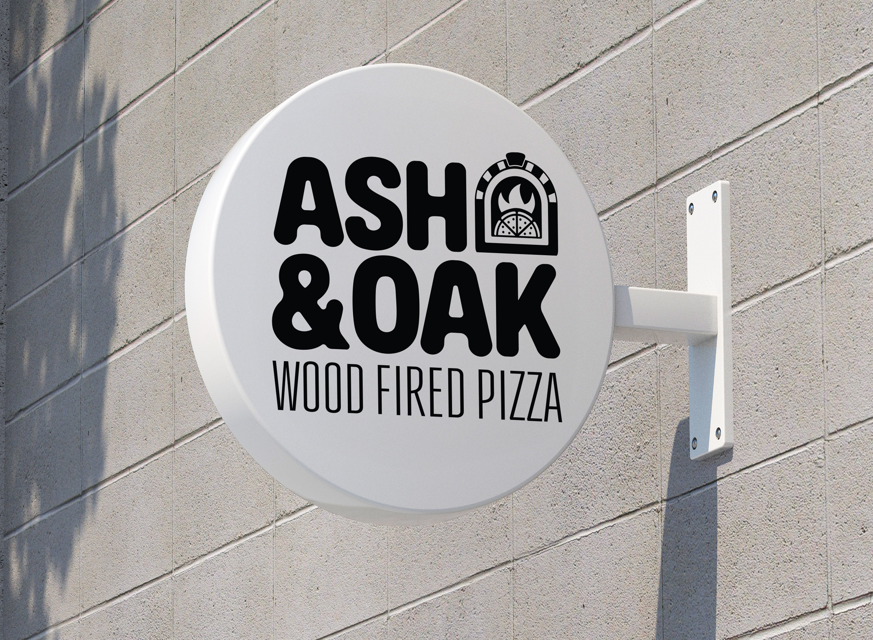
Logo
- Primary logo: a stacked serif wordmark with slight erosion — worn-in, not worn-out.
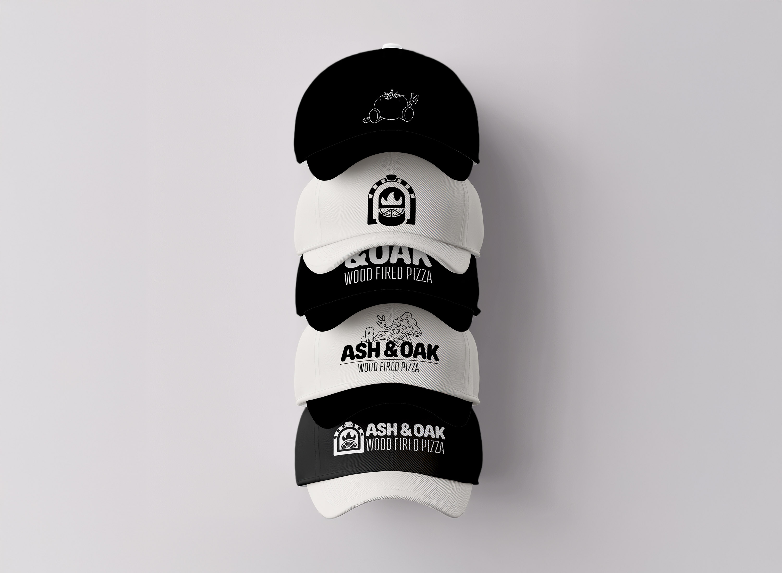
- Alternate lockups for small formats, including a built for hats, stickers, and signage.
Color System
- Charcoal – fire, stone, heat
- Blue – soft blues for balance
- Cream – light enough to soften the edges
The palette was chosen to mirror both the food and the space. Every tone was grounded in texture — not chosen from a color wheel but pulled from the oven.
Type System
- Headings: Serif with editorial rhythm and subtle curves
- Body: Modern sans with consistent tracking — clean, practical, unfussy
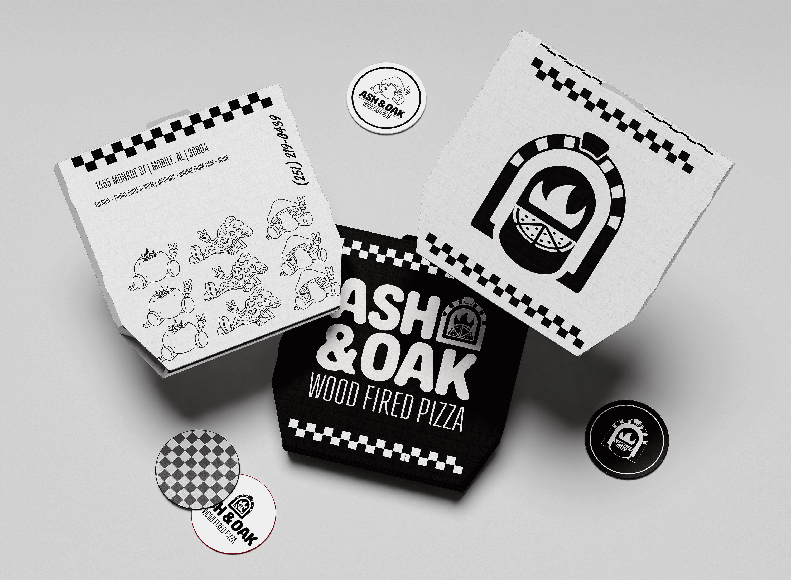
Deliverables
- Full identity suite (logos, icons, brand guide)
- Merchandise mockups (tote, tee, hat, apron)
- Messaging framework for launch
- Usage guidelines for future expansion
Outcome
Ash & Oak didn’t just launch — they hit the ground running. Within 48 hours of opening preorder, they were sold out without spending a dime on ads.
Since launch, they’ve become one of the top-trending pizzerias in the region, with consistent foot traffic, local buzz, and strong word-of-mouth.
The brand presence helped position them as more than a new restaurant — they felt established from day one.
Reflection
This wasn’t about building hype. It was about building something honest.
The brand system doesn’t yell. It doesn’t chase trends.
It just stands there — warm, grounded, and fire-built — and lets the food speak.