PSA
.gif)
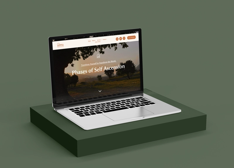
I created a visual identity for PSA that reflects its mission of personal growth, healing, and empowerment for the Black community. The designs use natural elements to convey serenity and transformation, combined with bold, straightforward messaging that speaks honestly to the audience. This approach highlights PSA’s focus on guiding individuals through their self-ascension journey.

Category: Marketing Materials & Brand Collateral
Role: Creative Lead, Designer, Strategist
Outcome: A tactile, QR-integrated campaign crafted to connect PSA’s healing mission with a younger, no-BS audience across Denver and beyond.
The Setup
PSA came to me with a clear purpose — build collateral that feels grounded, candid, and real. This wasn’t about fluff or overly spiritual design. This was about connecting with people where they are: in transition, in healing, and in search of truth.
We skipped the fake polish and leaned into authenticity. We held strategy work sessions, mapped out their audience, and created marketing touchpoints that could live in the real world — in books, on water bottles, on mirrors, in quiet moments of reflection.
The Challenge
How do you take a spiritually rooted brand and make it feel accessible and magnetic to a modern, younger audience?
PSA already had a following — they needed connection points that didn’t feel preachy or disconnected.
The solution? A mix of high-quality print collateral that was both beautiful and interactive, grounded in:
- Minimalist design
- Bold language
- Integrated QR functionality
- Consistent visual rhythm across every item
The Deliverables
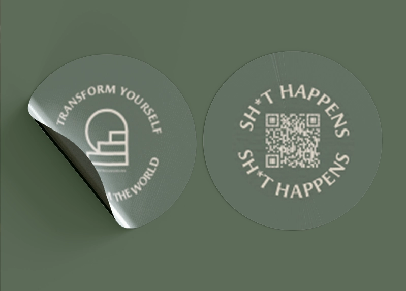
Stickers
- Design Focus: Direct, eye-catching language (like “Sh*t Happens”) paired with clean, bold type.
- Interactive Element: Custom QR codes linking back to PSA’s deeper content, meditations, and affirmations.
- Purpose: Subtle but powerful — designed to live on laptops, journals, street poles, or anywhere that invites curiosity.
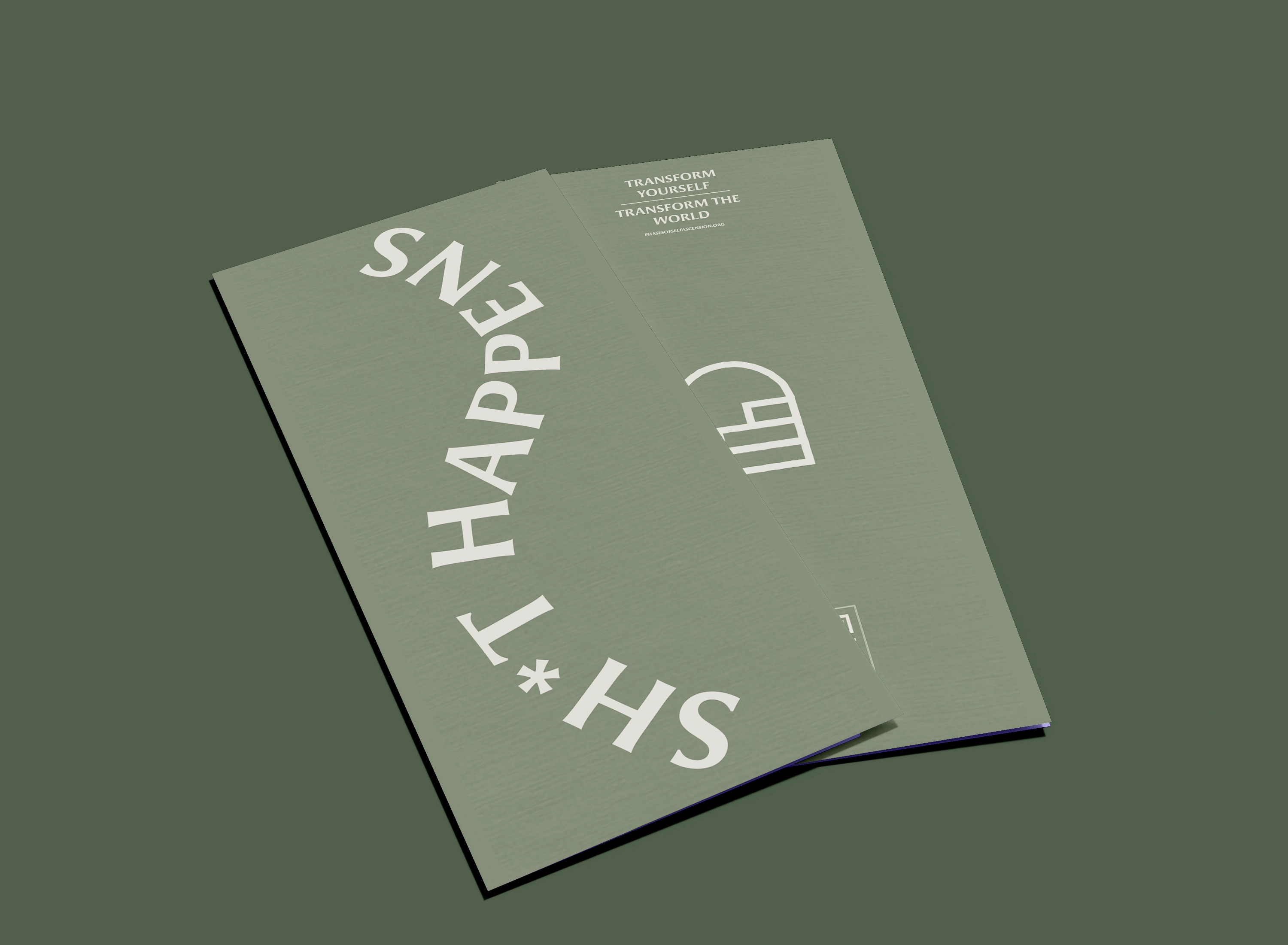
Brochure
- Design Focus: Earthy tones, grounded energy, minimal copy with maximum resonance.
- Structure: Informative but not overwhelming — crafted for people who don’t have time to read, but need something that sticks.
- Purpose: A soft entry point into the PSA ecosystem — shared at events, retreats, and community hubs across Denver.
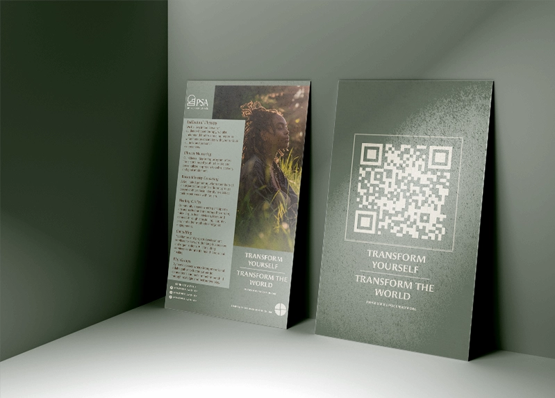
Bookmark
- Design Focus: Calm, serene visuals paired with subtle language and a scannable QR.
- Functionality: A daily reminder — something tangible that lives in someone’s current read, reflecting PSA’s deeper mission.
- Purpose: Keep PSA’s message present in quiet moments. It’s functional. It’s brand-aligned. It works.
The Process
- Creative work sessions to nail down tone, direction, and key phrases
- Concept moodboards and material mockups for client review
- Iterative design based on team feedback — subtle shifts in tone and palette over time
- Print specs and prep for production, ensuring materials stayed high quality from screen to paper
- QR strategy — each piece tied back to PSA’s growing digital ecosystem
Outcome
These collateral pieces have become staples across PSA’s presence — from workshops and retreats to casual interactions around the city.
The materials invite engagement, not just observation. They're meant to be picked up, flipped through, scanned, and shared.
And they’ve helped PSA deepen their presence with intention — all without losing their voice.
Reflection
This project reminded me that branding isn’t always about a website or a logo.
Sometimes it’s about how your message lives offline — on someone’s nightstand, in their journal, or on their water bottle.
It’s about meeting people where they are — and leaving something behind that makes them pause.