DROPOUT BAKERY
.gif)
I led the design and production of Dropout Bakery’s first merchandise line — a full brand extension built to match the bakery’s playful, rebellious energy. From moodboarding and garment selection to illustration, tech pack creation, and every detail was intentional. The line sold out after a successful preorder campaign, proving that Dropout wasn’t just a bakery — it was a lifestyle brand in the making.
Category: Merchandise / Apparel Design
Timeline: ~1 month
Client: Dropout Bakery
Annual Revenue: $1M+
The Setup
Dropout Bakery had already made its name — a million-dollar bakery brand with a strong local following, killer products, and an edge that set them apart from the average cupcake shop. They weren’t looking to scale food — they wanted to scale culture.
The team came to me with a clear goal: create a merch line that matched their energy.
Something people would wear — not just to support the business, but because it actually looked good. Our job was to bridge the gap between bakery and streetwear.
that the catalog was visually appealing, informative, and resonated with the target audience.
My Role
I led the full creative execution from concept to delivery:
- Designed custom graphics and illustrations
- Selected blanks and measured samples
- Created the tech pack for production
- Directed the visual presentation for preorders
- Collaborated directly with the in-house team on concept, fit, and tone
This wasn’t just “put the logo on a hoodie.”
This was brand extension — done right.
Creative Direction
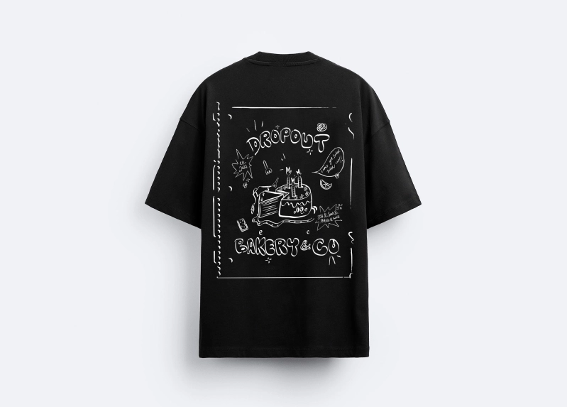
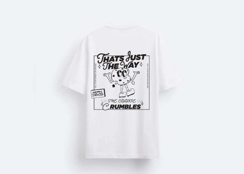
We started with a moodboard rooted in nostalgia and attitude. Think: vintage high school rebellion energy, stacked with playful graphics, handwritten typography, and ironic nods to school culture.
The Dropout name did a lot of the work — so we leaned into that concept fully. The clothing wasn’t just branded merch — it was a uniform for the anti-perfectionist, sweet-toothed troublemaker.
Process Breakdown
1. Concept & Moodboard
Pulled reference from old varsity jackets, yearbook clippings, and 90s lunchroom vibes. Shared with the team to align on tone and humor level.
2. Design & Illustration
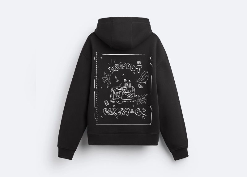
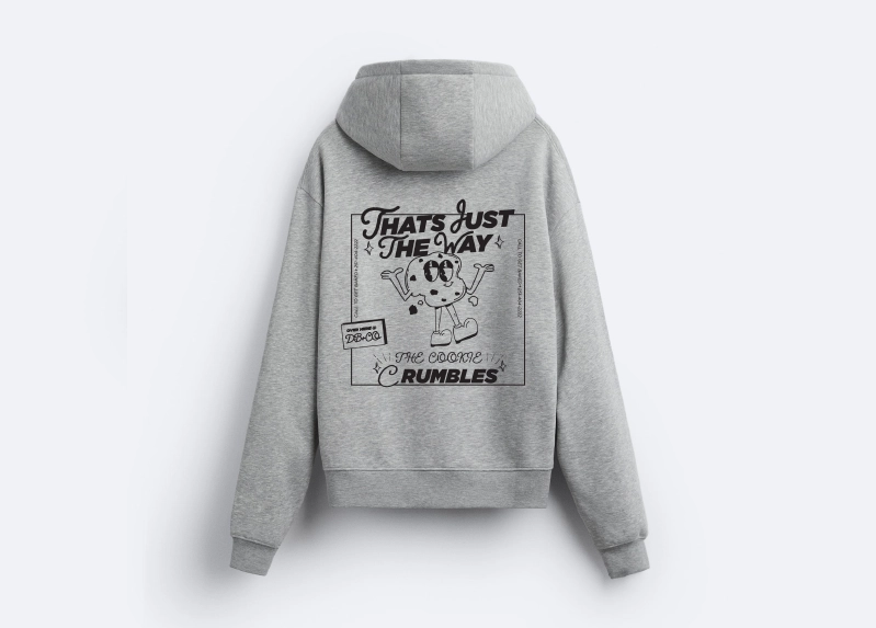
Created a set of graphics, patches, and logotypes that could mix and match across tees, hoodies, and accessories. The designs weren’t overly clean — they were meant to feel worn, doodled-on, or passed in notes.
3. Garment Selection
Worked hands-on with the team to source and size blanks — measuring fits, testing durability, and locking in colorways that would photograph and print well.
4. Tech Pack Creation
Created a full tech pack — including placement guides, Pantone color specs, garment measurements, and label details — and shipped it to LA for production.
Deliverables
- Custom illustrations and logotypes
- Full tech pack for LA manufacturer
- Merch mockups across 5+ items
Outcome
The line sold out.
The community showed up because the clothes felt like they belonged — not just to the bakery, but to the people who built the brand by showing up every week for cookies and cinnamon rolls.
More than merch, it became a brand moment — one that proved Dropout could move culture, not just product.
Reflection
This was my first time running apparel production from top to bottom — from picking blanks to labeling file names for a cut-and-sew partner. It taught me how to build fashion at a real level: fit, material, identity, and feeling.
Design doesn’t live in the logo. It lives in how people wear it.