BLACK GIRL'S HEALING HOUSE
I focused on creating a visual identity that aligns with its mission of holistic wellness and community support for Black women. Incorporating key elements of empowerment, transformation, and connection, the redesign captures the brand’s essence while honoring THE vision. BGHH has been featured in Essence and recognized by Facebook. The updated branding reflects the spirit of mind, body, and soul integration, highlighting the unique and supportive space that BGHH offers.
Category: Branding
Timeline: ~2 months
Tools Used: Adobe Illustrator, Photoshop
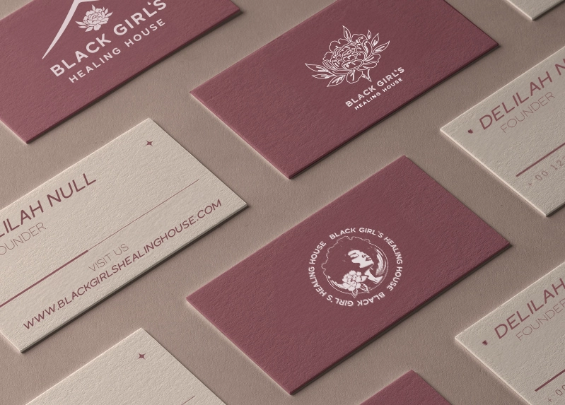
Client: Delilah Null, Founder of BGHH
Community Size: 100K+ across Facebook, IG, and Meta platforms
Press Features: Essence, The Root, Meta
The Setup
Black Girl’s Healing House had already built something powerful: a digital sanctuary for Black women focused on holistic healing, wellness, and community. They had over 80,000 members in their Facebook group, had been featured in Essence and The Root, and were in active partnership with Meta.
But there was one thing missing: a true visual identity.
The brand had never been formalized — no logo, no system, no guide for how it should show up across platforms or grow into merchandise, events, or digital products. It needed clarity and structure, without losing the spirit that made it special.
My Role
I was brought in to design the full brand identity from scratch: logo system, color palette, typography, and visual direction — all rooted in the community’s voice and the founder’s story.
But it was more than a design job. It was about helping translate intention into form — and building a system that could scale with the brand as it continued to grow.
Discovery & Strategy
We didn’t start with visuals. We started with lunch.
I sat down with the founder, Delilah, to understand why she created BGHH — not just what she needed on paper.
She shared how the vision began in college — born from a lack of mental health resources and community for Black women. Inspired by the Black Panthers, BGHH was built to be a space for healing, transformation, and empowerment — all rooted in joy, softness, and self-ownership.
Process Breakdown
1. Questionnaire & Strategy Brief
We kicked off with a custom creative brief to align on values, audience, and brand language. From there, I mapped out early symbol systems — nature, softness, power — and began narrowing concepts.
2. Moodboards
I created moodboards that explored duality: the softness of healing (peonies, pastels, meditation) versus the structure of empowerment (crowns, fists, sacred geometry). These became a touchstone for every creative decision that followed.
3. Three Full Concepts
I delivered three original directions for feedback:
- A modern monogram system
- A full illustrative identity with house + flower integration
- A modular symbol-forward identity designed for social, merch, and web
We iterated through three rounds of revisions, fine-tuning everything from typography weight to color balance and icon spacing.
4. Final Brand System
What we landed on was a system that speaks clearly — but with softness.
Visual Identity System
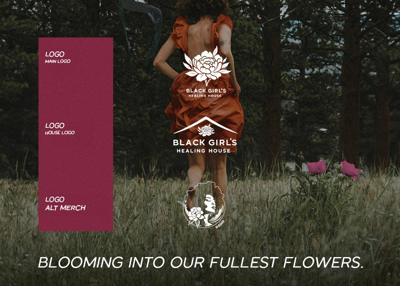
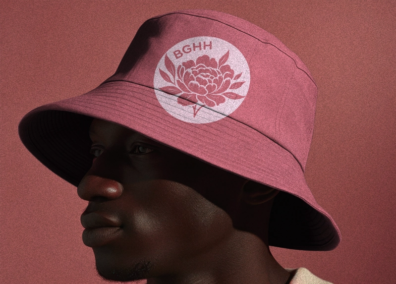
Primary Logo
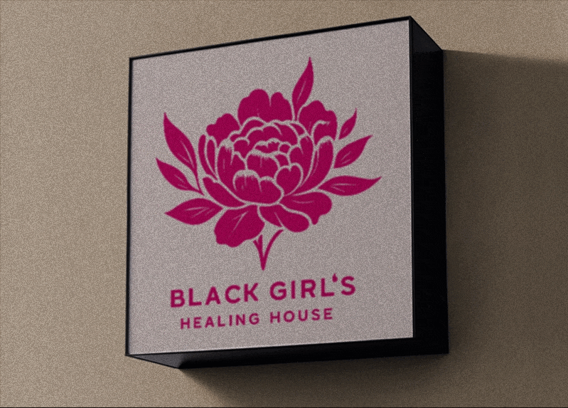
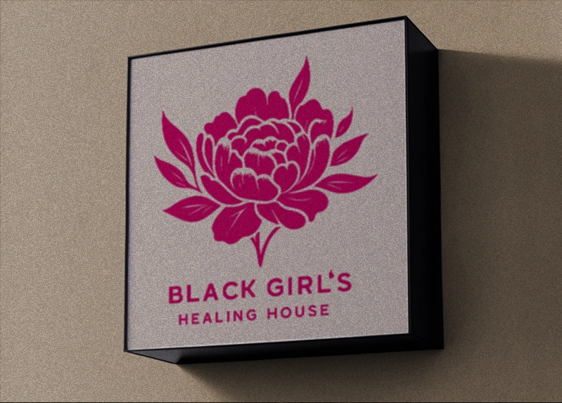
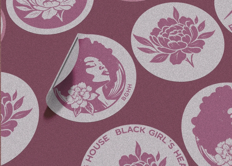
- A house-shaped logo with a blooming peony emerging from its center — symbolizing transformation, home, and rebirth.
- Soft upward motion in the mark reflects growth and healing.
- Influenced by traditional family crests and community banners — nodding to legacy, care, and protection.
Iconography
- Alternate face and flower icons designed for profile pictures, merch tags, and social posts.
- Created for flexibility across platforms, from tiny favicons to large-scale prints.
Typography
- Headline: Laro Soft Semi Bold — elegant and clear with enough strength to stand on its own.
- Body: Complementary modern sans-serif for digital use.
Color System
- Magenta (#cc0771) – warmth, femininity, vibrance
- Blush Pink (#f6c7ff) – softness, safety
- Sage Green (#8b997b) – calm, earth, rootedness
- Brown (#80401b) – strength, heritage
- Black & White – to ground and give contrast
Each color was chosen for its psychological resonance with the audience — not just aesthetics.
Deliverables
- Full logo suite (primary, secondary, icon variants)
- Brand guidelines PDF
- Typography system with web-safe recommendations
- Color codes (CMYK, RGB, HEX, Pantone)
- Exported file packages: PNG, SVG, EPS, PDF, AI, JPG
- Master logo breakdown doc for internal team use
- Ready-to-use templates for merch, social icons, and digital media
Outcome
The identity gave BGHH its first cohesive, scalable brand system — something that finally matched the power of the community behind it.
Since launch:
- Merchandise sales increased through clear, recognizable branding
- Digital materials look cohesive and intentional across every platform
- The founder was able to pitch and present with full brand confidence — no more cobbled-together visuals
- The identity became a symbol of healing and transformation, instantly recognizable to over 100K community members across Facebook, Instagram, and beyond
Reflection
This project wasn’t about creating a trendy logo. It was about creating a home — for healing, softness, growth, and strength — that could hold space for thousands of Black women and their stories.
The logo system didn’t just reflect the brand.
It became the brand’s backbone.